Did I mention the “c” word? I think I might have done.
“What colour?” seems to be the biggest cause of argument on the railway. Occasionally you see it used for good such as in the case of deciding what colour to paint Duchess of Sutherland where punters could vote… for a fee, thus raising the money for the repaint in the process. By showing how the voting was going, and publishing it in the railway press, additional votes (and therefore revenue) were secured by people desperate for a particular colour scheme. Smart work, whoever thought of that one.
One benefit of the younger brigade of railway volunteers starting to swarm some of the UK’s railways is the reduction in all things BR black. The upsurge in the late 90s and early 2000s was a direct result of those people who could remember the days of steam being in charge of the paintbrush. As they get too old to volunteer, or too old to be in decision making roles at least, we are seeing more colour come back, which is a good thing in my books.
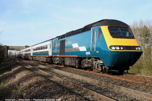
A well applied livery can make such a difference. A bad one can look appalling. You can see on today’s railways the difference between those that get it and those that don’t in their livery applications. Some railways get it very right. Midland Mainline for example seem always to manage to provide a livery that works. The teal and tangerine livery, followed by the blue, followed by the latest EMT liveries all worked for their time (and continue to do so).
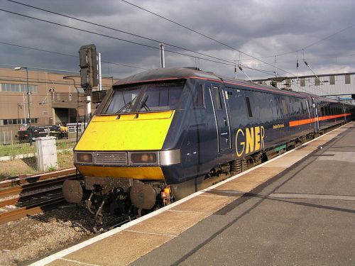
As did GNER’s blue and red.
Second from bottom of the livery pile for me are Northern’s class 333s. The original livery was smart. Very smart. On the lines they first ran where there hadn’t been anything new for donkeys years it was like seeing the Vulcan at Farnborough airshow in 1952 when all you were used to were Lancasters. Unfortunately they have since had several partial vinyl wraps and that red/blue mix just make you want to vomit.
However, the winner (or loser) of worst livery ever is DOR’s East Coast. This is a good reason why the railways shouldn’t be under Government control. Brand awareness just doesn’t seem to be a Government skillset.
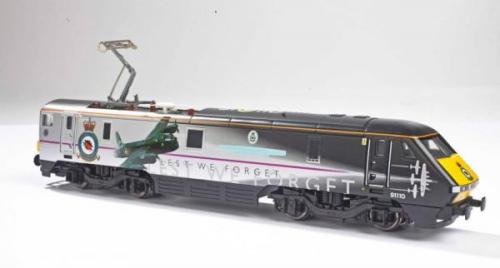
East Coast have one saving grace. It’s the Battle of Britain Memorial Flight class 91, 91110, the British record holding locomotive. You may not like the livery but it is distinctive so it ticks some of the livery boxes.
However, getting back to the East Coast norm, which civil servant nitwit thought a grey train (OK it’s supposed to be silver but it is grey in pretty much all light) would look good? Not only does it show up every single crinkle and dent on the Intercity 125s and 225s but the person who came up with it hadn’t been looking out the window that day and noticed the sky in the UK is uniformly… GREY! When you get a train you want to be cheered, spirits lifted, hop, skip and a jump, etc. Never before has anyone produced a livery (and I use the term loosely here) that can depress people more. The purple stripe doesn’t help either. It’s a small trickle of colour that has escaped the bland artist on the bandest palette immaginable.
A livery should be a symbol of the company. A beacon of advertising. A distinction from the world around it. If East Coast’s livery is a beacon of DOR, the sooner it is back in private hands the better. And the purple stripe? It reminds me of the scene from the Italian Job when they all jump in the Dormobile after they’ve done the raid. They’re all looking so glum and one of them says “Look ‘appy you b@rrstards…we won didn’t we?” and one of them responds with a limp wave of a balloon.
That’s East Coast’s livery: a sad, depressing, grey day punctuated with a limp purple balloon.


